Color has a powerful effect on our psyche, and for this reason color experts and psychologists use color in different ways to evoke specific emotions. Think about this for a moment – hospitals and clinics use a lot of blues, greens and purples. Before you go on air at a TV show, radio show or podcast, you wait in a green room. Many fast-food places use red and yellow in their logos and marketing material. Have you ever wondered why these colors are used so commonly in the same places? As experts have found, different colors create different feelings. For this reason, they use specific colors to draw out those specific feelings.
How experts draw on the psychology of color
Blue, green or purple in hospitals
As we previously pointed out, hospitals and medical clinics use a lot of blue, green and purple. These colors, especially in muted tones, promote relaxation. In particular, blue is known to create a sense of calm and healing. If you were a doctor, these are all feelings you would want to create in your patients as well as their families and friends. Given how calming these colors are, it’s no surprise that they’re also commonly used in waiting rooms and spas.
The red carpet
Red creates feelings of excitement, confidence, and energy. With this knowledge, it makes total sense that red is used at the entrance to major celebrity events like the Oscars. After all, this is where the paparazzi line up to snap their photos, and everyone could use a bit of a confidence boost before having their picture taken. The use of the red carpet also creates a sense of anticipation for the event ahead and coaxes everyone’s social butterfly out in advance. Thanks to these effects, what looks like a simple red carpet has become a crucial ingredient in social events all over the world.
Red and yellow with food
In addition to evoking feelings of excitement and confidence, red is also known to make people hungry. When combined with yellow, a color that creates a sense of comfort, red is a powerful color to use when you run a restaurant, fast-food joint or food delivery service. Think of the major fast-food restaurants – McDonald’s, Wendy’s, Burger King, KFC, Pizza Hut, Chick-Fil-A, Subway, Hardee’s. What do all of these fast-food chains have in common? They all use red, yellow or a combination of both. The use of red evokes hunger, while yellow makes us associate all these brands with comfort food.
Green rooms
We’ve already talked about the fact that green creates a serene, restful environment around us. In fact, there’s a scientific reason for this – since the human eye focuses the color green straight to the retina, perceiving greens causes less strain to the eyes. There’s also a simpler explanation that has to do with the prevalence of the color green in nature. Being out in nature satisfies our biophilic needs – our need to be close to other living beings. For this reason, reproducing the green backdrop of nature in a green room can calm you down before the curtain rises and you find yourself in the spotlight. Whether you’re a singer, comedian, motivational speaker or tv show guest, spending some time in the green room before you go live can be incredibly calming.
Colors most often used to promote comfort
Psychology experts all over the world have studied the relaxing effects of different shades of blues, greens and purples. These colors are especially effective at creating a serene atmosphere in muted shades. For this reason, they’re commonly used in settings where people are likely to get agitated or need to be calmed down. In addition to hospitals, waiting rooms and spas, these colors are frequently used in bedrooms to create a relaxing environment where people can wind down at the end of the day. It doesn’t matter whether you choose to paint the walls of your bedrooms blue, green or purple, or you get bedroom décor in one or more of these colors. Either way, the prominence of these colors will help you wind down properly at the end of the day.
The relaxing effect of green bedding
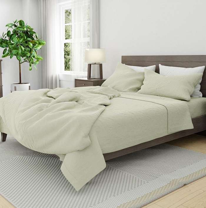
Since it’s associated with nature and the outdoors, the color green is the most relaxing color on the visible spectrum. The sleep experts at Skylark+Owl have drawn on the color’s relaxing effects to create their newest collection of bedding linen in seafoam. This linen collection is 100% Garment Washed European Flax Linen. It’s made in Portugal and certified by Oeko-Tex® to be free of harmful chemicals.
“With this new collection, we wanted to create an atmosphere of relaxation, tranquility and harmony,” says Skylark+Owl founder Suzanne Sparrow. “We drew inspiration from dewy summer mornings and blue-green waters. We took note of the little things that make summer summer: crashing waves, crisp limes and sunny meadows. We love how this color reminds us of the ocean and summertime. By adding our new seafoam linen to your bedroom, you can bring nature indoors and create a serene sleep oasis.”
What does Skylark+Owl do?
Skylark+Owl is the product of a group of comfort experts who are committed to preserving the daily ritual of sleep with well-crafted bedding. By leveraging 75 years of experience in comfort, this company designs duvet covers, sheet sets, pillowcases, towels and bathrobes using the finest fabrics from experts around the world. With this wide variety of bedding, Skylark+Owl customers can nest in comfort at the end of a busy day.
The seafoam linen collection is a great addition to Skylark+Owl products, which are all designed to ensure that you rest easy each night. Since green is associated with the natural habitat, this collection goes one step further in helping the team at Skylark+Owl to achieve their goal – crafting bedding products that help you turn your bedroom into a cozy nest where you can unwind at the end of each day.
If you want to upgrade your sleep, check out the products that Skylark+Owl has to offer to turn your bed into a cozy nest.
You can also connect with Skylark+Owl on Instagram, Facebook, and Pinterest.


